While delving into the depths of designing an interactive user application or a web interface, the first and foremost buzzword a designer encounters is, “User Interface/UI Design ” or “User Experience/UX Design.” Often there seems a lot of confusion between these two. When someone says that he/she is a designer, people usually don’t get a clear picture as what they actually do.
Are UI and UX the same thing? Or one is just a part of another?
Go through this complete guide diligently and by the end of it you’ll get a clear and comprehensive understanding of the following:
- What exactly are UI Design and UX Design?
- Differences between UI and UX.
- How to design a stunning UI & UX.
- 5 Common Mistakes that kill your conversion rate.
UI or User Interface
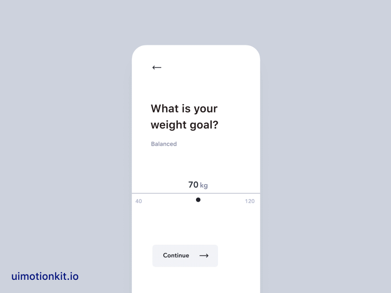
Courtesy: dribbble.com/kristina
The UI design is all about the look and feel, the presentation and interactivity. It deals more with the aesthetics and less with the functionality part of a product.
It includes:
1. Typography:
Robert Bringhurst defines typography as the craft of endowing human language with a durable visual form. It has the power to convey emotions, transfer a message and most importantly define content hierarchy. The font family, size, weight, color, the text structure, everything matters. The readability of the text can have a massive impact on how users experience the product.
2. Color:
If we talk about visual arts, color is the soul of an artistic piece. It can say a thousand words without even presenting a single letter. In UI design, it can perform several functions like supporting and carrying the brand recognition, focusing on the critical parts like a call-to-action button, or beautifying the interface, etc.
3. Component style:
A user interface can contain multiple components such as a background, text fields, input fields, buttons, cards, etc. Designing UI requires pre-planning the elements’ style to maintain uniformity throughout the whole product. A designer has to decide the shape, color, size, even the situation where the same component has to change its form.
4. Layout arrangement:
It includes organization, arrangement, and spacing of the things mentioned above. The app screen or web page layout has to be arranged keeping in mind the hierarchy of the content and how to control the eye movement of the end user. Visual weight has to be balanced, and proper spacing should be provided so as not to make the content look cluttered. A designer has to arrange components according to their importance.
UX or User Experience
As humans, we are obsessed with things that look good.
A functional and aesthetically pleasing user interface may turn many heads, but it is not the only thing that is needed to retain users. When a design decision is made based only on how good it should appear, the product is no longer being designed for the users. That is where UX comes in the spotlight, and to the designers’ rescue.
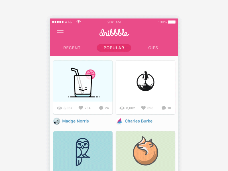
Courtesy: dribbble.com/ramotion
User experience design is a human-first way of designing a digitally interactive product. This term was first introduced to the Tech industry in the 1990s by Don Norman who was a cognitive scientist and co-founder of the Nielsen Norman Group Design Consultancy and according to whom, “User experience encompasses all aspects of the end user’s interaction with the company, its services, and its products.”
This process is scientific and can be applied to any real-life situations and places such as our room shelves, vehicle experience, movie theaters, etc.
If you want to provide a good user experience, ask yourself the following questions:
- Is the product user flow designed so that the user can achieve their objective quickly?
- Is the usability good enough that the user can use the product easily?
- Are design decisions being driven by reliable data and user research?
- Is the product intuitive enough to guess and present what the user wants?
UX design provides solutions to real-life user problems. By thinking through questions like the ones mentioned above, and finding an acceptable answer to each one of them, a product designer can achieve this goal. It is a relatively new field because companies worldwide are slowly realizing that it is equally important to attract, as well as retain users through their product.
A UX designer’s role includes a myriad of responsibilities, namely:
- Analyzing competitors and customers
A competitive analysis helps a UX designer to gather useful information about the product landscape, its details, the market share, etc. It is also done to research the user demographics, visual design language, content, and language. This data is then compared to have an understanding of the product’s general competition. - Deciding product structure and strategy
While vision gives clarity for the desired goal, strategy defines the journey to achieve it. Even before the design and development begin, a strategy is made to create milestones of what should be done step by step.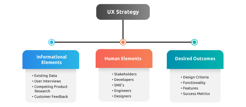
The following elements constitute a good UX strategy - Wireframing
Wireframes are like the backbone of designing a product, also called a low fidelity prototype/representation. It contains the elements needed on a screen and the order in which it should come. It is created quicker than the actual design because everything is represented in its purest form (e.g., crossed rectangles for image placeholders). In the wireframing stage, it is easier to do changes after gathering feedbacks. - Prototyping
While wireframing provides the visual idea of the planned layout, prototyping gets more close to the actual product. It consists of middle to high fidelity representation. It gives the look and feel of the final product as well as the interactions, which further proves itself helpful in user-testing.
So, to sum it up, UI design is how products appear, and UX design is how it functions.
Points to Ponder On
1. Don’t just design transitions, but the whole interaction
Designers go head over heels seeing those fabulous Dribbble designs and fancy transitions. The innovations that have occurred in modern interactive devices such as smartphones, smart-watch, etc. have made it possible to bring in a plethora of effects and inspirations too such as scrolling animations, button transitions and all sort of flashy things. While it is tempting to use these from a predefined library, the goal should not go out of focus. Use whatever is necessary and feasible for development.
2. Think Quality over quantity
Following types of data could emerge from user research:
- Quantitative:
Survey results, A/B test data and conversion rates – measurable data that indicates numbers – where, when or how much. - Qualitative:
Observations of user test participants quote from contextual interviews – data that helps the product designer understand the why.
If being in a dilemma, or being in a situation where only one of them can be chosen, having an understanding of why users do something is more valuable than having numerical measurements that may not even be helpful in the issue involved.
Recommended Read: Top Trends In Design and Web Development
3. Use more research methods
Every research method has its perks as well as drawbacks. That is why using a mix of them can provide more dimensions to the data acquired. Triangulating research can enable UX designers to confirm data accuracy and relevance, helping them to have a more precise view.
4. Use more participation
It is required to have a common showcase arena where the project progress, findings, and planned steps can be exhibited to promote more transparency and participation. Choose the participants strategically and make it easy to access whatever is relevant to them. Users, stakeholders and colleagues, everyone collectively has more ideas, insights, and perspectives than a single UX designer, so take advantage of this great asset. Everyone may not be from the same demographic, but they drive the design to a more user-centric approach, which further promotes relationship building and helps build something astounding by collaboration.
5. Be visual in the first steps
While design documents provide insight into client requirements and user needs, it is preferable to be more visual. You don’t need to worry even if sketching is not one of your skillsets; nobody needs to be an artist while delivering ideas about the user flow and design. One of the most significant benefits is that it provides a broader understanding of the problems a UX designer is trying to solve.
Common Mistakes that are Killing Your Conversion Rate
The facts below provide an overview of the current situation:
- 38% of users leave a website if the content or layout is unattractive.
- 47% users expect a web page to load in two seconds or less.
- 95% of visitors agree that good user experience is the most crucial element of a website.
- 94% of people will close and stop trusting a site if the website design is not engaging.
Mistakes that kill your conversion rate
The attention span of users is getting smaller day-by-day. They want results with less effort, less time and patience is barely existent. Getting through many screens to get what they want is a huge turnoff which drives them away, especially in a market where there are many more competitive products and content out there.
Mentioned below are some aspects that might be killing your conversion rate:
-
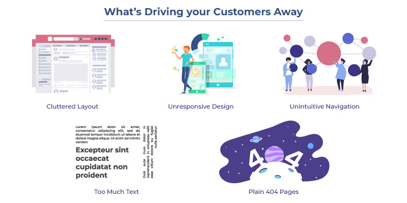
- Confusing and Cluttered Layout
Putting more and more content in one visible part of the screen order to put it in the users’ glance at first, is a terrible idea.If everything is made to draw attention, none of them gets it
A designer should think more precisely and put themselves in users’ shoe to understand – What is the most important thing they may want to know or do. Information should be presented step-by-step according to that importance. There should only one goal that is to be focused – Conversion.
- Confusing and Cluttered Layout
-
- Device Unresponsive Design
More and more users are using digital services on their mobile or tablets, which are easy to carry on-the-go. When they are not able to enjoy the best features on small screens, they leave. Responsive design of a digitally interactive product makes it flexible across all screen resolutions.
- Device Unresponsive Design
-
- Unintuitive Navigation
After de-cluttering the content, the next task at hand is deciding the hierarchy and navigation. What a website or application has to offer should be evident in the heading, and how they can gain from it should be described shortly in subheadings. Do not re-invent the wheel. Put things where users’ expect to find it. Do not make many positions, look or form changes from what they are used to. This might confuse and frustrate them. User-friendly navigation keys are critical, as there is only a second or two to convince a user to stay.
- Unintuitive Navigation
-
- Text-Text Everywhere
Nobody has the time to go through blocks of text. What an end user does is comb through it to get an overview of the subject. Therefore using related, informational, and soothing imagery may take the users out of the monotonous boredom of reading and at the same time feed the knowledge about the text they might not be reading. So try to use less but precise wording wherever applicable.
- Text-Text Everywhere
-
- The 404 Dead-End
There are situations where a user might not be able to find what they need and land on a 404. Consider a use case of an e-commerce application, where the user cannot find the product he/she was looking for. Such situations can be creatively utilized to drive the user to someplace where they could have a new start. The home page or the seasons’ new outfit collection might be a good place to start with. Presenting the users with aesthetically pleasing illustration, or animation of an empty crate is also an excellent way to hold on to them.
- The 404 Dead-End
Concluding View:
“People ignore designs that ignores people.”
— Frank Chimero, Designer
Over the last decade, hardware has witnessed tremendous transformation. Now products have become much cheaper, efficient and smaller. Therefore making similar softwares proficient of beautiful animations, graphics, and interactions is extremely critical.
Now it is just not enough for designers to create an efficient application. Users are expecting more and more out of their devices; they want impeccable efficiency along with beautiful graphics and tasteful interactions.
This transition is pushing designers to get more creative with their design strategy.
The responsibilities of a designer have unbundled to much more than they used to be. With the influx of so many domains, designers now need to be appropriate ‘specialists’.
That is why designers at EngineerBabu are handpicked from the crowd to create the best possible user experience possible for our customers. We have solid expertise in creating world-class design solutions. With a portfolio of more than 100 exquisitely designed products under our wings, the tremendous hard work our dedicated team puts-in is quite evident from the smile of our satisfied customers.
Check out our creatively designed products, right here.
Recommended Read: