Being a front-end web developer is not easy. One thing that you have to do daily is to decide which framework/library you want to use for your components/segments in your project.
Note: If you are well aware of the concepts of Flexbox and Media Queries, you can clone the project here.
There are two primary things that a front-end developer has to deal with:
- Data Manipulation
Hitting the API’s, fetching the data and then manipulating data based on the requirements on the client side. - Data Population
Showing the manipulated data in a presentable manner
Correct data population can vastly impact user experience. We live in a mobile-first era, and thus, appropriate data population according to the screen sizes becomes even more critical. The user doesn’t care the amount of data till the time it is easily readable.
Not deviating from the topic in hand, tabular representation of data has always been difficult for me, and the only reason was – RESPONSIVENESS
I have been working in Angular from quite some time, and whenever I had to use a tabular representation of data, I used to search for libraries for responsive tables. I won’t deny that there aren’t some very powerful libraries out there that help with pagination, sorting and filtering of data within the table but that comes under DATA MANIPULATION. They even claim to be responsive, but the libraries FAIL under 2 conditions:
When a different type of data is to be populated
Whenever there are 3-4 types of data in a single row like a checkbox, string, number, drop-down and buttons, the library is bound to fail.

When there are many columns with variable width
Column names and cell data in a table are rarely of equal widths, and thus the variable width disturbs the orientation of the table, in turn breaking the responsiveness. After working with multiple libraries like ngx-datatable and trying to customize frameworks like Bootstrap or Angular Material by their CSS, I decided to solve the mystery of responsive tables once and for all!
Give a man a fish, and you feed him for a day. Teach a man to fish, and you feed him for a lifetime.
– Maimonides
So let me teach you to develop YOUR OWN RESPONSIVE table, where you can control the column widths according to the viewport/screen width and have multiple types of inputs in a row.
The only thing we need – CSS Flexbox.
CSS Flexbox
The Flexible Box Module, usually referred to as flexbox, was designed as a one-dimensional layout model, and as a method that could offer space distribution between items in an interface and powerful alignment capabilities.
– developer.mozilla.org
In simple terms, Flexbox helps to align items in row and columns.
If you haven’t heard about it yet, I would recommend you to go through this:
For Basics: https://www.freecodecamp.org/news/learn-css-flexbox-in-5-minutes-b941f0affc34/
For a Comprehensive Guide: https://medium.com/@js_tut/the-complete-css-flex-box-tutorial-d17971950bdc
Flexbox Cheatsheet:
https://yoksel.github.io/flex-cheatsheet/
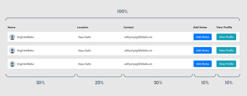
Our aim is to show data in tabular representation on bigger/wider screens (width > 768px) and in collapsed/card view of each row on screens less than 768px wide.
There are two things we need to understand to implement responsiveness of the tables:
- Flex Basis – Flex basis specifies the initial length of the table cell, which here is our flexible item.
Available values:
flex–basis: number | auto | initial | inherit;
Number: A length unit or percentage
Auto: This is the default value. It takes the length of the content inside it.
Initial: It sets the property to its default value
Inherit: It inherits the property from its parent
- Media Queries
Whenever we need to control how our elements look on different screen sizes (desktop, mobile, tablets), we use media queries to specify break-points. We can write different styling for the same element on either side of the break-point.
There are 4 standard break-points that we use:
- 576px – small devices
- 768px – tablets
- 992px – desktops
- 1200px – large desktops
This can be used with:
- min-width –specified minimum width and up
- max-width – less than the specified maximum width
For Example – and I personally use:
// Large devices (desktops, less than 1200px)
@media(max-width:1199.98px){...}
// Medium devices (tablets, less than 992px)
@media(max-width:991.98px){...}
// Small devices (landscape phones, less than 768px)
@media(max-width:767.98px){...}
// Extra small devices (portrait phones, less than 576px)
@media(max-width:575.98px){...}
Source: getbootstrap.com
Also Read: Angular Authentication Using JWT
CONTROLLING WIDTH OF COLUMNS/CELL
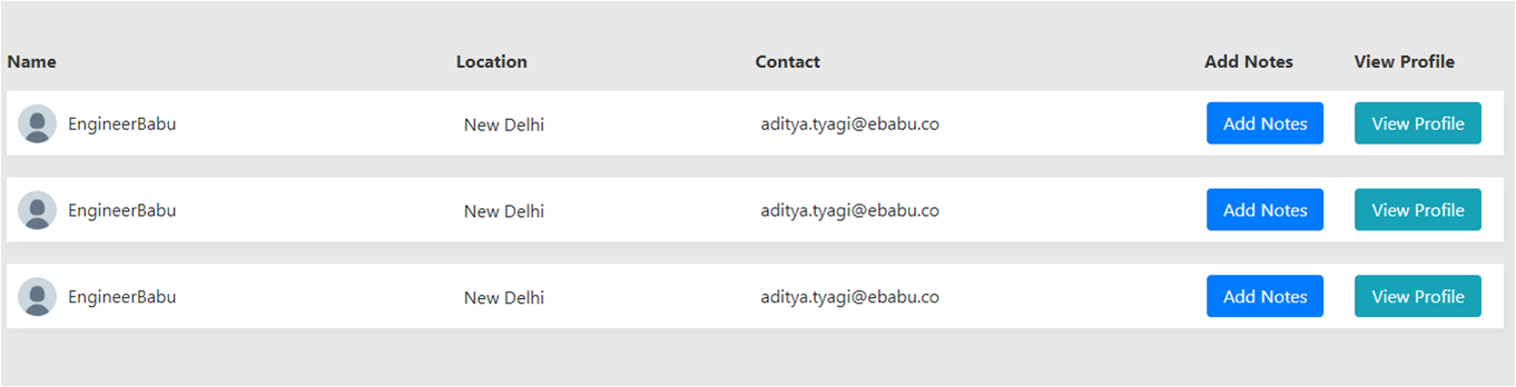
We’ll use flex-basis to control the width of each column. Flexbox works with the help of two things – Flex Container and Flex Items. The row becomes the flex container, and the table cells are flex items. If the content is more than the cell width, it wraps to the new line. We consider the table row (flex container) to be at 100% width and thus divide the column widths accordingly in percentages (%).
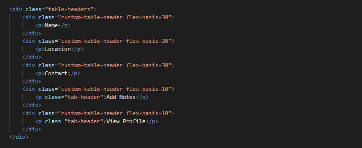
Here, the row – table-headers is considered 100% of the width. It also serves as the flex-container.The row is then divided into 5 columns of variable widths:
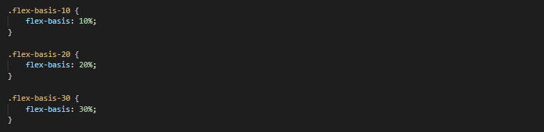
30% + 20% + 30% + 10% + 10% = 100%
flex-basis-30 = 30% space of 100%
flex-basis-20 = 20% space of 100%
flex-basis-30 = 30% space of 100%
flex-basis-10 = 10% space of 100%
flex-basis-10 = 10% space of 100%
This creates the columns with the desired widths, and on increasing the screen-width, the table cells (flex-items) adjusts according to their flex-basis percentage value.
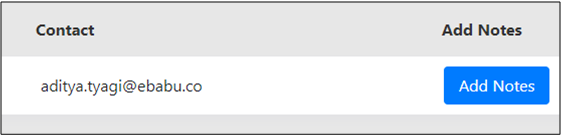
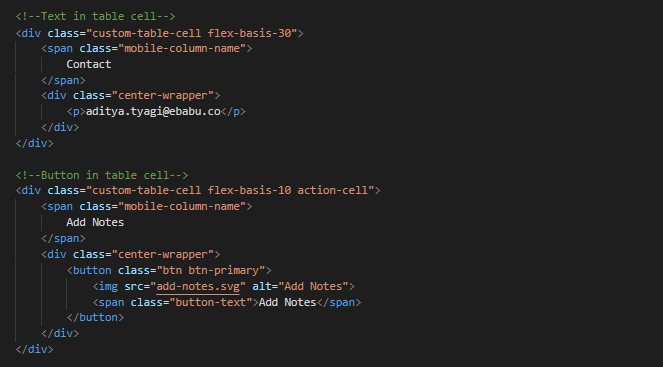
ADDING DIFFERENT TYPES OF DATA IN TABLE CELLS
Once you have specified the width, then sky is the limit. You can add anything and everything as data in the cells which HTML permits – from dropdowns to checkboxes, radios buttons to lists, images to block buttons.
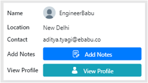
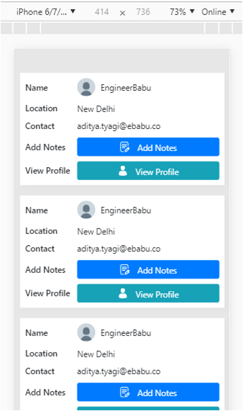
COLLAPSING ROW INTO CARDS ON MOBILE VIEW
Tabular data is not recommended on mobile views due to the complexity and unease of viewing data. One thing that we can do to tackle this is that we can collapse the row into a card and then view tabular data via card view.
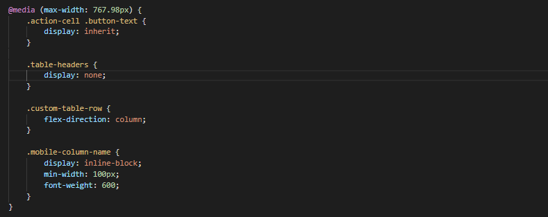
We’ll be using media queries to style the cards and cell data. One thing that is great about flex-basis is that it is like any other CSS property and thus we can change the width of the columns on different screen widths. This gives us true flexibility and empowers us to make the table TRULY RESPONSIVE.
Wrapping Up:
You must be thinking of how the title of this blog justifies the content. Tables and that too responsive table have been a dreaded element for me, up until now! Any framework, be it Angular, Vue.js or React that I worked with and any project that I took had a table in it, and therefore I had to find a permanent solution. Hence I decided to learn it.
I agree that the libraries and frameworks out there provide great tables with functionalities like sorting, filtering, and pagination, but those are data manipulation. Once you create responsive tables with flex-basis and media queries, you can programmatically manipulate the data being shown, i.e. filter, sort, and search: which in turn helps you understand how things work under the hood of the libraries you use.
You might argue that this is like re-inventing the wheel. I consider this as understanding how the wheel is developed in the first place so that you can make a better, faster, more efficient wheel.