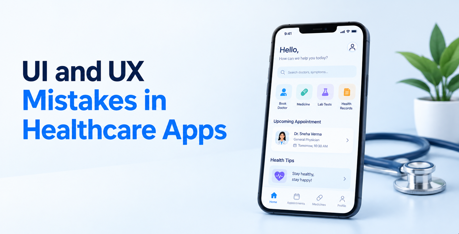
UI and UX Mistakes in Healthcare Apps (And How to Fix Them)


Create engaging, high-performance mobile applications tailored to your business needs. We craft future-ready apps that offer smooth user experiences on all devices.
Build robust and scalable websites and CMS platforms that help you manage content effortlessly. Our development ensures a seamless digital presence.
Launch secure, feature-rich online stores with intuitive shopping experiences. We build tailored eCommerce platforms designed for growth.
Design captivating games with immersive gameplay and stunning graphics. From concept to launch, we build engaging experiences that players love.
Enhance your customer relationships with customized Salesforce implementations. Drive growth and efficiency with smarter CRM solutions.
Harness artificial intelligence and machine learning to automate workflows and gain actionable insights. Our AI transforms data into smart decisions.
Accelerate your software delivery lifecycle with continuous integration, delivery, and infrastructure automation to boost efficiency.
A patient wakes up at 2 AM worried about a blood test result. She opens your app, gets asked for a member ID she cannot find, forgets her password, waits on a six-digit code, and finally sees a number with no explanation next to it. Ten minutes later she is asking an AI chatbot what her result means.
That is not a hypothetical. Rock Health’s latest Consumer Adoption of Digital Health Survey found that 32% of US adults now use AI chatbots for health information, double the share from the year before. Patients are not waiting for a better interface. They are routing around the one you built.
So this piece walks through the specific UI and UX mistakes in healthcare apps that cause that drift, what each one actually costs you, and the fix that works.
TL;DR
The biggest UI and UX mistakes in healthcare apps are:
Each one adds friction at a moment when the user is anxious, tired, or in pain.
A shopping app loses a sale when the checkout stutters. A health app loses a refill, a follow-up, or a flagged symptom.
Your users are rarely in a calm state. They are post-diagnosis, mid-flare, caring for a parent, or reading results on a phone in a parking lot. Cognitive load is already high before your interface adds any.
That is also why so many teams misdiagnose the problem. They assume adoption is a feature gap and ship more, when the real reason telemedicine apps fail is usually that the core task takes too long. Adding screens to a confusing app makes it more confusing.
Member ID, group number, pharmacy, emergency contact, consent forms. All of it before the user sees a single useful screen. The person downloaded your app to check one result, not to complete enrollment.
Onboarding sets the tone for patient engagement, and a nine-field form sets a poor one.
What it costs you: The steepest drop-off in your funnel, usually before account creation finishes.
The fix: Let users in with name, date of birth, and phone. Collect insurance details later, inside the task that actually needs them.
Strict password rules, mandatory MFA on every open, and two-minute session timeouts feel safe to a compliance reviewer. To a 68-year-old with a tremor, they feel like a locked door.
Security is non-negotiable, but a HIPAA compliant app can still use biometrics, trusted devices, and longer sessions on low-risk screens.
What it costs you: Repeat password resets, abandoned logins, and a spike in support calls.
The fix: Tier your authentication. Face ID for viewing, step-up verification only for sensitive actions like record downloads or payment changes.
“Encounter.” “Prior authorization pending.” “LVEF 48%.” These are fine in a chart. In a consumer-facing screen, they read as a different language.
Vocabulary sits near the top of the patient complaints that portals can fix without building anything new at all.
What it costs you: Confused users who call the clinic anyway, which defeats the purpose of the app.
The fix: Write labels the way a nurse explains things out loud. Keep the clinical term, add a plain-language line under it.
A value floating on a white screen tells a patient nothing. Is 5.9 good? Is it worse than last time? Should she worry tonight or mention it next month?
Pulling values through healthcare API integration is only half the work. The interface still has to interpret them.
What it costs you: Anxious patients, unnecessary messages to clinicians, and a slow erosion of trust in your data.
The fix: Show the reference range visually, mark where the value sits, add the previous reading, and state clearly whether action is needed.
Thin gray type, 32-pixel tap targets, gesture-only navigation. It photographs beautifully in a portfolio and fails in a cardiology waiting room.
Accessibility is not a late-stage audit item here. Running accessibility testing early catches contrast and screen reader failures while they are still cheap to fix.
What it costs you: You exclude older adults and chronic-condition patients, who are your heaviest users by a wide margin.
The fix: Minimum 16px body text, 44px tap targets, WCAG AA contrast, full screen reader labels, and one-handed reachability on key actions.
Users tap through specialty, location, and provider, then hit a screen that says “call the clinic to confirm.” Every step before that is now wasted effort.
Appointments are the reason many people install the app at all, which is why smart scheduling systems carry so much weight in retention.
What it costs you: Lost bookings, higher no-show rates, and reinforcement that the phone works better than the app.
The fix: Show real available slots pulled live, confirm instantly, and let users reschedule or cancel in two taps without calling anyone.
Daily medication reminders, portal messages, survey nudges, marketing, and billing alerts all arriving through the same channel at the same weight. Within a week, the user mutes everything.
Alert fatigue hits hardest in remote patient monitoring app development, where every device reading can trigger a ping.
What it costs you: Muted notifications mean missed critical alerts, which is a clinical risk, not just a product one.
The fix: Separate clinical alerts from administrative ones. Give users channel-level control, and set thresholds so only meaningful readings generate a push.
Someone with chest tightness should never hunt through a settings menu for a contact option. Yet support is often three levels deep, behind an FAQ, behind a bot that will not hand off.
AI chatbots for healthcare handle routine questions well, but they need a visible exit to a human.
What it costs you: Frustration at the exact moment your app is being judged, plus real safety exposure.
The fix: Keep a persistent support entry point on every screen. Show expected wait time, and escalate automatically when symptom keywords appear.
Adult children manage parents’ appointments. Parents manage kids’ prescriptions. Spouses track post-surgery recovery. Most apps force all of this through one login and one profile.
Proxy access is the single largest unmet need in elder care app development, and it rarely appears in the first spec.
What it costs you: Shared credentials, broken audit trails, and caregivers who give up and call the clinic instead.
The fix: Build multi-profile switching with permission levels, consent records, and a clear indicator of whose data is currently on screen.
Clinicians work in bursts between rooms. Large hero images, carousels, and generous white space waste the screen space they need for dense, scannable information.
A clinical decision support system that adds four extra clicks per order will be ignored by week two.
What it costs you: Low provider adoption, which stalls the entire product since clinicians drive patient usage.
The fix: Design the clinician view separately. Prioritize density, keyboard shortcuts, fast chart switching, and default values pulled from the last encounter.
You rarely get told about bad UX. You get told about numbers that will not move.
Watch for a drop-off cluster on a single onboarding field, password reset requests above 15% of monthly active users, and support tickets that repeat the same screen name. Also track time to first meaningful action, meaning how long it takes a new user to view a result or book a visit.
Setting up that instrumentation belongs on your list of tasks after launching your healthcare app, not six months later when retention already flattened.
Most of this work costs days, not sprints. Skipping it is one of the quieter hidden costs in healthcare app development, because redesigning a shipped product always costs more than redesigning a prototype.
EngineerBabu builds patient portals, telehealth platforms, RPM tools, and clinician-facing systems with design validated before engineering starts. The UI/UX design work includes patient testing, accessibility review, and clinical language review as standard steps, not optional add-ons.
That sits inside broader healthcare software development delivery covering HIPAA compliance, EHR integration, and post-launch iteration on real usage data.
Almost every one of these UI and UX mistakes in healthcare apps comes from the same root cause. The product was designed around what the system needs to collect, rather than what the person on the other end is trying to do at that moment.
Flip that order and most of the fixes become obvious. Your users are not asking for a more impressive app. They are asking for a shorter distance between opening it and getting an answer.
Heavy onboarding forms, rigid authentication, untranslated clinical jargon, context-free lab results, poor accessibility, dead-end booking flows, notification overload, hidden human support, missing caregiver access, and clinician screens that add clicks.
Because the first session fails them. If a user cannot complete the task that made them install the app within a minute or two, they revert to calling the clinic or searching elsewhere.
Muted notifications hide critical alerts. Confusing dosage screens cause medication errors. Buried support delays escalation. In healthcare, usability defects can become safety defects.
Five to eight participants per round surfaces the majority of serious issues. What matters more is recruiting people who match your real condition, age, and caregiver profiles.
They should share the design system but not the layout logic. Patients need clarity and reassurance. Clinicians need speed and information density on a single screen.