App Development for Foldable Devices: Design & Testing


Create engaging, high-performance mobile applications tailored to your business needs. We craft future-ready apps that offer smooth user experiences on all devices.
Build robust and scalable websites and CMS platforms that help you manage content effortlessly. Our development ensures a seamless digital presence.
Launch secure, feature-rich online stores with intuitive shopping experiences. We build tailored eCommerce platforms designed for growth.
Design captivating games with immersive gameplay and stunning graphics. From concept to launch, we build engaging experiences that players love.
Enhance your customer relationships with customized Salesforce implementations. Drive growth and efficiency with smarter CRM solutions.
Harness artificial intelligence and machine learning to automate workflows and gain actionable insights. Our AI transforms data into smart decisions.
Accelerate your software delivery lifecycle with continuous integration, delivery, and infrastructure automation to boost efficiency.

TL;DR
A foldable is not a bigger phone. It is a device that changes size while your app is running, which is a problem most codebases have never been asked to solve.
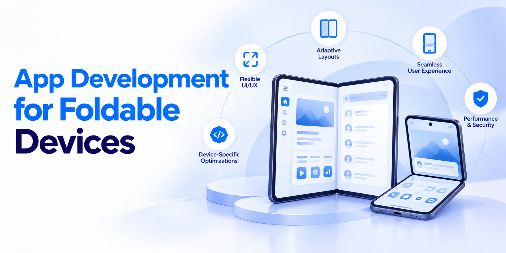
App development for foldable devices means building one app that behaves correctly across a phone-sized outer screen, a tablet-sized inner screen, and the partially folded positions in between. Unlike responsive web work, the resize happens mid-session, often mid-task, with the user watching.
The volume now justifies the effort. Counterpoint Research reports global foldable shipments will hit a 100-million cumulative milestone by the end of 2026, with the segment growing around 20% through the year.
This guide splits into the two halves that actually consume project time: design and testing.
Before any layout work, define what your app shows in each physical state. Folded means a narrow outer display, usually one column and one task. Unfolded means a near-square inner display with room for two panes. Half-open, sometimes called tabletop or book mode, splits the screen across a hinge and suits media controls, video calls, and camera viewfinders.
Write down the primary action for each posture. Teams that skip this step end up stretching the phone layout across the large screen, which produces enormous touch targets and acres of empty space.
Hard-coding for a specific foldable model guarantees rework when the next one ships with different dimensions. Use window size classes instead, which group widths into compact, medium, and expanded buckets.
Compact gets single-column navigation. Medium gets a navigation rail. Expanded gets a two-pane list-detail layout. The same breakpoints serve tablets and large phones, so the work pays off beyond foldables. This is where solid UI/UX design foundations save real money, because a design system built on breakpoints absorbs new form factors without a redesign.
The hinge occupies physical space, and on some devices it is a visible seam or a gap. Content placed under it becomes unreadable, and buttons placed there become unreachable.
Query the display feature API for hinge position and orientation, then treat that region as padding rather than usable canvas. For media apps, let the hinge become a natural divider: video above, controls below. Never let text or a primary action straddle it. A single sentence split across a crease is the clearest signal an app was never tested on the hardware.
This is where most app development for foldable devices goes wrong, and it is invisible until someone actually folds the device.
An unfold triggers a configuration change. If state lives in your activity or view layer, the user loses scroll position, half-typed text, video playback progress, or their place in a checkout flow.
Move state into a ViewModel or equivalent persistence layer, and save transient input explicitly. The fix is routine in modern Android app development and takes far longer to diagnose than to implement, since the bug only reproduces on real hardware.
Users expect to start a task folded and continue it unfolded without restarting. That means the unfolded view should expand the same screen, not open a different one.
List-detail patterns make this straightforward. Folded shows the list, tapping opens detail. Unfolded shows both side by side with the previously selected item already open. Modern Kotlin app development with adaptive navigation components handles most of this wiring, so the effort goes into deciding what pairs sensibly rather than into plumbing.
Device-based matrices miss the interesting failures. Build around state transitions instead.
| Test condition | What breaks most often |
| Fold while a form is partially filled | Input values reset |
| Unfold during video playback | Playback restarts from zero |
| Rotate while unfolded | Layout falls back to phone dimensions |
| Half-open with camera active | Viewfinder crops or stretches |
| Fold during a network call | Duplicate requests or lost response |
| Multi-window with two apps side by side | Touch targets overlap or clip |
Run each transition both directions. Folding and unfolding frequently produce different bugs, because the teardown path and the rebuild path are not symmetric.
Android Studio ships foldable emulators with posture controls, and they catch roughly the first half of your layout issues cheaply. Use them during active development.
They will not catch hinge rendering accuracy, fold animation jank, thermal throttling on the large display, or how the app feels in half-open mode held in one hand.
Budget for at least one physical device per major form factor. Folding hardware behaves differently enough that structured application testing on real units remains non-negotiable before release.
Driving a bigger, denser inner screen costs more than teams expect. Frame rates that were comfortable at phone resolution can drop noticeably once the panel doubles in area.
Profile rendering on the unfolded display specifically, not just the outer one. Watch for over-drawing in two-pane layouts where both panes animate at once.
Most fixes come from the standard toolkit covered in mobile app performance optimization, applied to the layout that is now doing twice the work.
Touch target sizes, focus order, and screen reader navigation all shift when a layout changes from one column to two. Focus order in particular tends to break, jumping between panes in an order that makes no sense when read aloud.
Test with TalkBack active across a fold transition. Confirm the reading order follows the visual hierarchy in both states, and that focus lands somewhere sensible after the resize rather than resetting to the top.
Running accessibility testing on both postures catches issues that single-screen audits never surface.
App development for foldable devices rewards teams that treat screen size as a variable rather than a constant.
Almost all the required work, including breakpoints, state preservation, and adaptive navigation, improves your tablet and large-phone experience at the same time.
The effort is front-loaded and the payoff is durable. If you are planning foldable support for an existing Android product or building one that needs it from launch, EngineerBabu handles that adaptation inside standard delivery rather than as a separate workstream.
Typically 10 to 15% of frontend effort when planned from the start. Retrofitting into a fixed-layout codebase often costs three to four times that.
Apple has not shipped a foldable iPhone, but iPad multitasking creates similar resize conditions. Adaptive layout work on iOS transfers directly if a foldable arrives.
No. Emulators handle layout and posture logic well but miss hinge rendering, fold animation smoothness, thermal behavior, and real one-handed ergonomics in half-open mode.
Tabletop mode is the half-open posture with the device resting on a surface. Video, camera, and conferencing apps benefit most. Utility apps can safely ignore it.
Native Android with Jetpack WindowManager offers the most complete posture API coverage. Flutter and React Native both support adaptive layouts but lag slightly on hinge-specific features.